
Page 35 - Summer 2007
P. 35
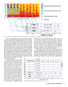
 Fig. 1c. Construction of the CHKDOT plot formed from the frequency bands containing the piano (upper notes and lower notes) and the bass.
 After selecting useful frequency bands in the spectrogram, time series graphs of the changing amplitude of each frequency band was created. Figure 1c illustrates the process of creating time series power graphs from the spectrogram. This was accomplished by adding the values for each separate time slice in each frequency band. The sum of a time slice in a frequency band was plotted as the Y value of the time series power graph for that frequency band at that point in time. The X value for the graph was set as the elapsed time (in the original recording) that corresponded to the time slice in the spectrogram. Values of the amplitude were obtained from the color in the spectro- gram. Each color represented a value in the spectral data set, specifically, the amplitude coefficient of the Fourier component for a frequency. This process allowed the amplitude of each instrument in the ensemble to be isolat-
ed as a function of time.
The next objective was to establish the elapsed time in the original record- ing for a “note event” (the “beat” when the note is played), i.e., the loudest time point in the vicinity of a sound pulse. The number of values in a time/frequency tile (one time slice for a frequency range) is typically between a few dozen and a few hundred, depend- ing on the size of frequency range. The set of summed totals in each frequency band for all time slices was used to cre- ate the time series amplitude graph for that frequency range. There were the same number of points in the time series as there were in the time slices in the spectrogram, simplifying time
comparisons between the different types of plots. The sever- al time series as played by each instrument or group of instruments that was generated from the chosen set of fre- quency bands were then stack plotted from low to high fre- quency as determined by a MATLAB script developed for this work. The plot and the program are called CHKDOT. The plot (see Fig. 1d) shows time aligned musical events for all frequency bands, as played by each instrument.
The computer code searched the CHKDOT waveforms for peaks representing the note events (peak amplitude in the frequency band). The time locations of these “note events” were extracted automatically by an algorithm that chose the point where the graph first turns back downwards immediate- ly following a sharp vertical rise above some predetermined
  Fig. 1d. CHKDOT plot of the Introduction to “It don’t mean a thing....”
 Technical Anaylsis of Swing Music 33
